PARTNER DASHBOARD
KIDPASS | 2019
Sole product designer in charge of the visual & UX design, competitive research, user research, usability testing, data analysis, strategy, and product definition.
MY ROLE
Researching, ideating, testing, and designing the solution took around 2 months.
TIMELINE
THE UNDERDEVELOPED B2B EXPERIENCE GATED COMPANY GROWTH
Kids activity providers needed self-service as support was required to do 90% of actions in the dashboard due to limited capabilities and unintuitive experience of the existing capabilities.
Supply was unable to grow at a steady rate due to the lack of features on the dashboard, including:
-
Ability to sign up on their and create a business profile
-
Ability to add new activities
-
Ability to add new schedules
-
Ability to add new locations
-
Ability to manage bookings, schedules, and customers
-
Less than half of the providers signed up with KidPass used the dashboard due to:
-
Outdated visual design
-
Unintuitive site navigation
-
Inefficient user flows
-
Lack of mobile responsiveness
-
THE PROBLEM


CREATE A SELF-SERVICE DASHBOARD
To address the problem, we had to design an easy to use self-service dashboard for providers to manage their schedule, listings, bookings, and more.
THE SOLUTION


THE ORIGINAL DASHBOARD HAD LIMITED CAPABILITIES, PREVENTING BUSINESSES FROM USING IT
Research
1
Ideation
2
Internal feedback
3
Usability testing
4
Design iterations
5
Designing a useful and effective solution to the problem required 5 phases:
PROCESS
Providers Want to Have Complete Autonomy
By querying the database and analyzing Mixpanel data, I was able to determine the quantitative usage of the dashboard:
-
Only 45% of providers were visiting the dashboard
-
Only 17% of providers were utilizing the existing dashboard features
-
I spoke with partner success admins to better understand what they were doing for the providers they worked with, which included:
-
Setting up business profiles
-
Adding new activities
-
Adding new schedules
-
Adding new locations
-
Managing bookings
-
Managing schedules
-
Managing customer profiles
-
I explored similar self-service dashboards for providers in a two-sided marketplace to understand existing patterns and layouts that users are accustomed to.
After analyzing data on current dashboard usage, hearing provider testimonials, and looking at competitors, it was clear that providers need to have full control over their dashboard or they won’t bother using it at all.
RESEARCH


DESIGNING BASED ON THE RESEARCH TAKEAWAYS
To start ideating, I began sketching out the layout of what the new dashboard could look like. The goal of this phase of the process was to scope out the MVP requirements and general structure of the pages in the MVP.
IDEATION
GIVING BUSINESSES FULL CONTROL OF THEIR LISTINGS & BOOKINGS WILL LEAD TO INCREASED SUPPLY


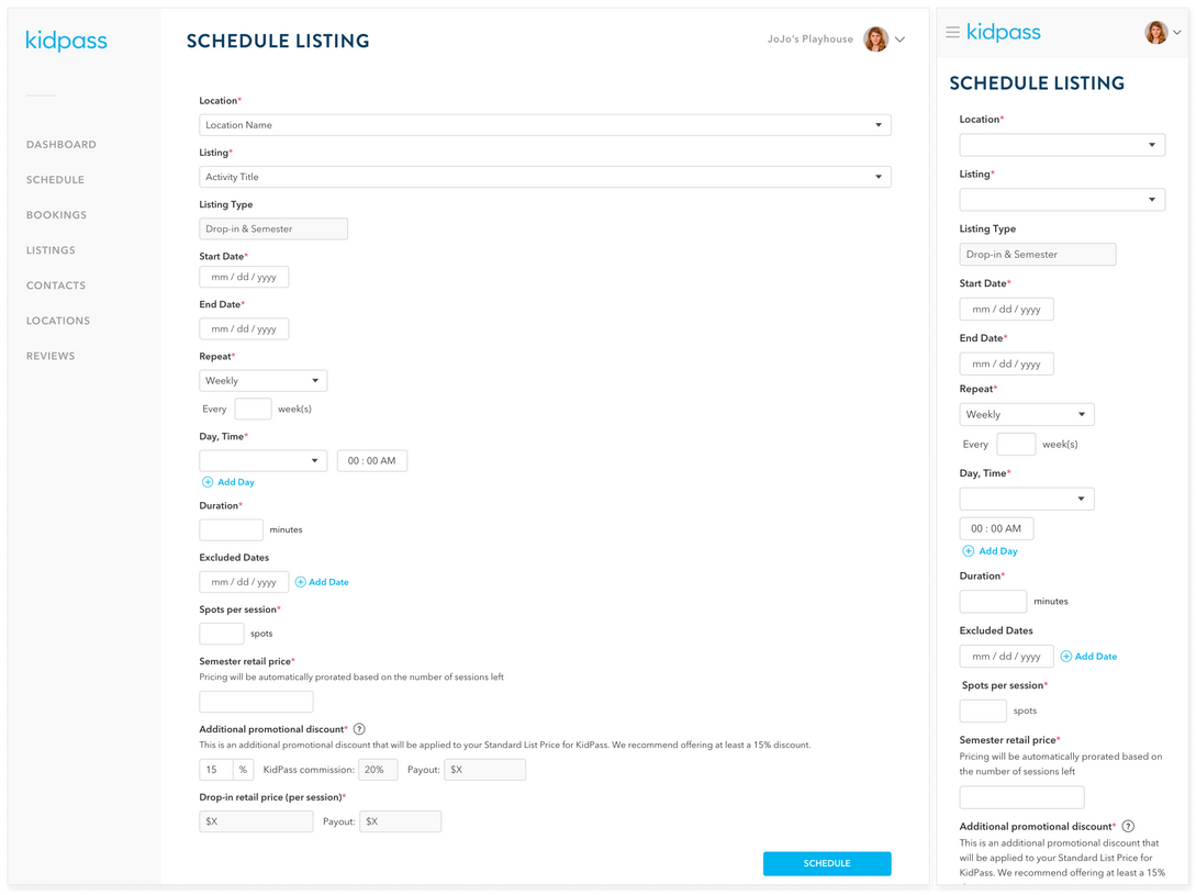
Adding clarity around pricing & payouts
Adding child ages next to the names on rosters


PROVIDERS WANT FLEXIBILITY AND TRANSPARENCY
After finalizing the user flows in a high-fidelity mockup, we put together user feedback and usability testing sessions with a some of our providers.
Through these sessions, we were able to validate the plan for this self-service dashboard and discover some areas of improvement. Overall, providers found the flows in the dashboard intuitive, but they wanted more flexibility and transparency, which included:
-
Allowing users to receive more notifications about schedule changes
-
Having the ability to manage the spots in their classes on a last-minute basis
-
Being able to see their pricing and the associated payouts
-
Seeing a child’s age next to their profile every time it is displayed
USABILITY TESTING
LAUNCH OF A FULLY SELF-SERVICE PARTNER DASHBOARD
After incorporating the usability testing feedback into the designs, I worked cross-functionally to ensure a seamless MVP launch. I worked with:
-
Engineering to discuss feasibility and QA designs,
-
Partner success to familiarize them with the new processes
-
Product management to scope out each iterative release
-
Marketing to plan release announcements
FINAL DESIGNS
DASHBOARD USAGE AND SUPPLY INCREASED
After launch, the data proved that the new dashboard was a success. Visits to the dashboard increased 172%, the percent of providers using the dashboard features increased 44%, and schedules added increased 63%.
The biggest takeaways from this project were reminding ourselves that we don’t always need to reinvent the wheel as users feel most comfortable using products that seem familiar and that transparency is key.
Moving forward, we will continue to add more flexibility to the dashboard and allow for more scalability with new features added.
OUTCOME
PROVIDERS WERE EXCITED ABOUT THE NEW DASHBOARD AND WE SAW THAT EXCITEMENT REFLECTED IN THE DATA


