CHECKOUT EXPERIENCE
BEGIN | 2023
Sole product designer in charge of the visual & UX design, competitive research, and usability testing.
MY ROLE
As the conversion in this funnel is key to business success, we wanted to develop a redesign as quickly as possible, so the entire design process around 1 week.
TIMELINE
HIGH DROP OFF RATES IN THE CHECKOUT FUNNEL
Users only saw the total they were expected to pay on the last step of the funnel, which caused sticker shock leading to users dropping off. Before checkout, users selected a plan that displayed the pricing in a monthly format, so users did not expect to see the larger sum of the price in the annual or bi-annual plan once they got to the step to enter payment information.
After users enter their payment information, they are brought to a screen that summarizes all the information they have entered with the header “Complete Your Order.” The intention of this screen was to have users review their order and confirm to complete their purchase, but many users thought this screen was their purchase confirmation, so they exited the experience here believing they had already purchased the product.
Not enough information was readily displayed above the fold or throughout the entire funnel. Users were unable to see what steps they should expect to go through during checkout, which caused hesitation in some users, leading to high drop off rates on the first checkout step. On the first few steps of the funnel, users also were unable to see their order summary, causing confusion and leading to drop off.
While ~50% of users were on mobile devices, the checkout experience did not have good responsive design. As users went through the checkout funnel, they entered more information, causing the amount of information on the page to increase. As users got to each new step, they had to do a lot of scrolling to see the important information and discover the actions they needed to take to continue checking out, which frustrated users, leading them to abandon their cart.
THE PROBLEM


ADDRESS THE POINTS OF CONFUSION TO DECREASE DROP OFF RATES
After assessing where the biggest drop off points were and why those pages were causing drop off, I redesigned the pages to address those points of confusion.
THE SOLUTION
THE UNINTUITIVE EXPERIENCE & LACK OF CLARITY THROUGHOUT THE CHECKOUT FUNNEL LED TO HIGH DROP OFF RATES
Research
1
Usability testing
2
Design iterations
3
A/B testing
4
Designing a useful and effective solution to the problem required 4 phases:
PROCESS
USERS WANT TRANSPARENCY AND A SIMPLE CHECKOUT EXPERIENCE
By analyzing Looker reports on the checkout funnel, we were able to determine which steps had the most drop off.
-
Users mainly exited the funnel on the first step (account creation) and on the last step before checkout was complete (review your order)
-
The first step drop off was likely due to the lack of transparency displayed on the order and on the checkout experience
-
The last step drop off was likely due to a combination of sticker shock and confusion as users may have thought they already completed their purchase and left the page thinking their order was placed
-
The checkout experiences of popular e-commerce sites all included an order details section displayed throughout the experience and a clear progress bar to indicate where the user was in the journey.
After analyzing data on the current activity & provider pages and conducting competitive research, we determined users do not want to spend a lot of time reading the details on the page to determine if they are interested in booking.
RESEARCH


DESIGNING BASED ON THE RESEARCH TAKEAWAYS
Based on the research, I sketched out ideas for the new checkout flow & layout.
IDEATION
HAVING MORE TRANSPARENCY THROUGHOUT THE CHECKOUT EXPERIENCE WILL INCREASE CONVERSION
VALIDATING THE RESEARCH-BACKED DESIGNS WITH REAL USERS
After iterating on the designs based on data analysis & competitive research, we put the new experience in front of users. They started the experience on a product detail page and were instructed to complete checkout.
Positive results:
-
On the first step of checkout, they understood the necessary steps to complete checkout
-
There was no sticker shock at the last step because they could see their order summary throughout the entire experience
-
Users were able to seamlessly go from payment information to completing checkout without confusion because we removed the review order step
Areas for improvement:
-
The mobile experience as users still had a lot of scrolling to do, which slightly frustrated them as they wanted to complete checkout quickly.
USABILITY TESTING


COLLAPSE EXTRA INFORMATION ON MOBILE
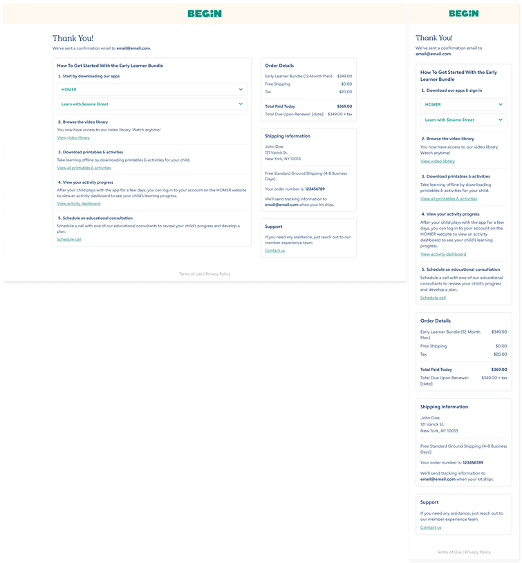
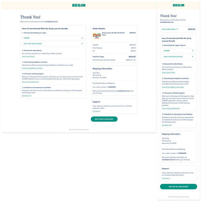
After noticing users had to scroll a lot on mobile on user testing, we improved the experience by collapsing extra information by default on mobile. This way, the information is still accessible to users if needed, but they no longer need to see redundant information on each screen in the checkout experience causing them to scroll further to complete the process.
DESIGN ITERATIONS
A SEAMLESS CHECKOUT EXPERIENCE
After finalizing designs based on the user testing feedback, I worked cross-functionally to launch the redesigned checkout flow as an A/B test against the current checkout flow. I worked with:
-
Engineering to review the new functionality and QA designs
-
Data team to run them through the new steps in checkout
-
Product management to scope out the process for implementing the new designs as an A/B test
The redesigned experience includes:
-
An order details summary on every page
-
A summarized total on mobile with the order details collapsed
-
A multi-step indicator and progress bar
-
Improved UX/UI for summary of past steps
-
Removal of the review order step and the ability to complete checkout after filling out payment information
FINAL DESIGNS
DROP OFF RATES DECREASED 40% THROUGHOUT THE FUNNEL
After A/B testing the redesigned checkout experience vs the existing checkout experience, the data proved the redesigned experience improved conversion. Drop off rates on each step of the checkout experience decreased and conversion rates increased 146%, leading to an increase in purchases. Due to these results, the redesigned checkout experience was fully implemented on the site.

The biggest takeaway from this project was to ensure we are always transparent. Users do not want to search to find important information, so it is always best to be upfront with necessary details. Moving forward, we will continue to monitor the drop off rates on each step of the funnel and iterate on designs where needed to continue increasing conversion.
OUTCOME
A/B TESTING PROVED THE REDESIGNED EXPERIENCE DECREASED DROP OFF RATES AND INCREASED CONVERSION


